Showing posts with label Planning. Show all posts

Wednesday, 4 March 2015

Possible Sequence Fonts

Below are many of the fonts that I considered for my films opening sequence and then ether didn't choose because they weren't good enough, didn't fit the film well enough or I found a font that worked better.

This font is call Coolvetica. I considered this font as it is simple and easy to read which is good for reading the titles however I felt that the text was to boring and wouldn't look good wit the effect that I had planned.

Modern Serif was another font that I considered. I thought that it may be a good font to use as it was more interesting to look at whilst still being easy to read, however I felt that the font looked too clean and therefore wouldn't fit as the font on my media product.

Movie letters was an interesting font that I could have used for my opening sequence as it looks quite squashed together and would fit the feel of my media product well, but the text came out too thin and would not work with the effect that I wanted to use, as the effect would need thicker letters to work well.

The font that I finally chose to use was called skyfall done. I wanted to use this as the font for my film as it was interesting and has a good effect on it that allows the text to still be readable but also makes in more interesting to look at that just plain text like the other fonts above. The font also worked really well for me as it was bold which meant that I was able to use the slow shattering effect that I wanted to use. I think that the combination of the font and the effect would work really well in my films opening sequence as it would also fit the mood and genre of the film also.

Tuesday, 10 February 2015

Practice shots

The video above shows many of the shots that we took in preparation for filming the actual shots. We did this so that we had abetter understanding of the camera and how to use the zoom and focus and as a result get better shots for our project on the day of filming.

Friday, 6 February 2015

Shooting Schedule


Above is the shooting schedule for our media product is shows the dates that we film on and what props, actors, equipment and the location where we needed to film. This was helpful as it allowed us to plan where we needed to be and what we needed to bring, this really helped with our planning as I felt it made us far more organised when it came to shooting our project.

Tuesday, 3 February 2015

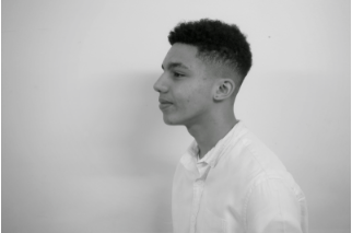
Casting Photos

  
Jack Hicks- Fraser

Jay Johnson- Aaron

Josh Wood- Oscar

Ryan Anderson- Ricky


Costume Design for our Opening Sequence

The presentation above shows a general idea of what the character in our opening sequence will be wearing, this is useful as we can plan for people to be wearing these things on the days that these characters are going to be seen in. The costume of all the characters are important as he clothes that the people are wearing can imply certain things about the character and we don't want to present the characters in a particular way.

Backing Tracks & Sounds For Our Opening Sequence

I chose to consider Mensa as a track for our opening sequence as the sound would suit a thriller sequence as the sounds are quite mellow and would feel like this would be played at a funeral, as it is a revenge thriller, and death will occur it seems relevant to the story line.


Beachhead a track that I also discovered that would be relevant to a revenge thriller. although this track can come across to be slightly up beat it creates a confused feel for the audience and make them question why this backing track is being played with the events that are portrayed in the film.


Dunes is a track I feel would be relevant to a revenge thriller as well mostly because of the piano used which sound very deep and gloomy, it would create a very dark atmosphere and make the audience feel very weary of what is going to happen in the film.


Leaves in the pool is another track I found which could be useful for our revenge thriller, the piano used creates a down beaten tone and makes the atmosphere very melancholy, this would let the audience know something sad happens or an bad event.


Friday, 23 January 2015

Storyboard Aninatic

This is the final storyboard/ animatic of the opening sequence to our film. We have followed conventions by having the production idents and the title in a particular order. The shots drawn are a plan of the shots that we are going to use as part of our actual opening sequence, though some shots may be added or moved in the shooting and editing process. We even added sound effects a voice in order to give a feel of what the piece may sound like. This animatic will work as a good plan for what we are going to film and how it will be put together so that we all have a clear cohesive idea of what we will be aiming for as an end product.

Thursday, 22 January 2015

Props

The following is a list of props that as a group we require for the opening to our film and the reason for it being needed in the piece:
  • The gun, this is needed in the piece as it is used but the antagonist as the end of the sequence to kill Oscar. we chose to have him use a gun instead of any other weapon because a gun massively creates a feeling of power, danger and a fear of the person in possession of the gun on the part of the antagonist but particularly here in the UK it perhaps also implies that this person is bad/ evil as it is illegal to have a own a gun. These thoughts are then strongly reinforce by the antagonist killing a seemingly innocent person. I believe that by using the prop of a gun we will be able to creates tension and shock in the audience rather than excitement.
  • the Phone, this is a key part of the opening of the story and to how we are going to create dramatic effect as we a voice message of our protagonist through it and it builds tension as it will make us fear for the life of the protagonists brother as it will inform that audience that Oscar is in danger before we even see that he is dieing. 
  • A broken door, this is show at the front of a run down house or at the entrance to a room as it indicates that the house/ room has been broken into with a significant amount of force, this will hopefully shock that audience as they will know that possibly something bad has happened in order for the house/ room to have been broken into. This prop will also help with building tension as is also carries a certain amount of ambiguity as it is only a small clue to what may have happened.
  • A skateboard, this is used in one of the very first shots. This is used as it gives an indication of the area that the scene is taking place and it helps to set the mood of the film, also the sound of a skateboard rolling against a silent background with low key lighting can create an eerie atmosphere that can immediately set the audience on edge and start the slow build up of emotions that start the film. 

Tuesday, 20 January 2015

Character Development

Main character: The main character of the this story is Aaron a boy aged around 19-20 and after witnessing a crime his brother (Oscar) is murdered, after oscars death Aaron seeks out revenge on the person/ group that unjustifiably killed his family member. Aaron is not the typical person to become a vigilante and perhaps is slightly unprepared to try and take on these killers, however he is determined to have revenge, though he sees it as fair justice for what has happened. he has quite a mature vision of the world and behaves perhaps older than expected of someone just turning 20. Aaron has a personality that is similar to other characters like:
Joel from the last of has the ability to become hardened to a point where he has almost lost a sense of morals as he sees that what he is doing for the greater good and therefore has little remorse when dispatching people in the way of his goals and in this chase Aaron's goal of to avenge his brothers death. (this is an idea of what  Aaron personality will evolve into as he evolves through the story)


He would dress in quite casual clothes and this make him blend in with others as he doesn't wear anything that would stand out or catch attention of others. This also make the audience find him quite relatable and this would help allow them to understand why they are doing what they are doing as he would probably dressing a similar way to the majority of the target audience.

The antagonist: This character is a seriously hardened murderer and seems to have no remorse when he kills people, as we seen him kill twice within the opening of the move with no real thought, he possibly even enjoys killing people as he could have left oscar beaten and on the brink of death but chooses when all of the other criminals in his group have left to "finish him off". he falls under the category of villains who "just want to see the world burn" in many ways he is just a darker and more extreme version of Aaron. the character or our antagonist is resembled in character like:
I feel that our villain is a milder version of the joker as he want to create this anarchy by killing Oscar  and follow some of the unpredictable nature of the joker, however he is not like the joker in the way that he is quite careful in not getting caught and this is the main reason for oscars death.
The appearance of our antagonist is similar to that of count Olaf in a series of unfortunate events, he wears quite dark clothing in clothes that are also possibly quite old fashioned. he appearance may also imply that he is slightly unhinged. But also we have made the decision to give him a tattoo on his wrist of an eye to allow the audience to identify the murderer without seeing his face. this is similar to the tattoo that Olaf has on his ankle which is also of an eye.


Sunday, 11 January 2015

Production Ident

for creating our production idents we where spit into groups of two so that we would have two end products and we could choose to use either of them or even use both. at the start brain stormed and them settled on deep magnum. we then started to create ideas and images for a possible main image and animation of our ident. we started to create an animation an image for a ident of a gun sinking to the bottom of the see to then shot out bubbles and the words deep magnum appear on screen. However after toying with this  idea and starting to create the ident we decided to alter the name and basis of our idea. This resulted in us changing the name to full magnum, this meant that we dropped the under the sea portion of the animation and just keep the falling spinning portion of the previous ident and the text. We did this as it gives the ident a more professional and adult feel to our ident, this fits our target audience better as it is cleaner and sharper and possible allows the audience to guess that we as a production company make thriller films. 

These are some of the early ideas that we have for our production ident. you can see concept art for the more complete original idea on the top and left, the possible name options in the bottom right such as: explosive productions, CoCONUTi (to be written from elements in the periodic table) these ideas where dismissed as we didn't feel that they fit our audience or the film that we were planning to make as well as full calibre.
These are the images that I made/edited using photoshop. The image with the white background of the gun was changed to make it look darker and more sinister this was use in the final production ident. the other image I though make make a good background for the production ident but in the end was roomed as the plain black we thought looked cleaner.

Sunday, 4 January 2015

25 Word Pitch

after the untimely death of a innocent child, the brother seeks out his killers to extract revenge for the pain they have caused.

Synopsis

The story that we have created is a revenge thriller. We open the film to see the death of the main characters friend after the pair witnessing an event that they were not meant to see. despite our protagonists best efforts, the attack results in his friends death. The story follows our protagonist as he hunts down the people who killed his brother. as we watch and see him turn from a average man into trained hunter seeking revenge for his friend and the injustice of what happened to them. 

Genre Choice and Reason

As a group we have come to the decision that we are going to create the opening of a film that would be grouped in the thriller genre. I believe that is was a good decision to have our film from the thriller genre as it allows us to be quite creative and it doesn't particularly restrict us when it come to planning as it could be set anywhere and have any variety of characters. this also give us the ability to make that target audience of the film to be a people like ourselves, I know that I personally enjoy thriller films as a genre such as Taken and Seven. Due to me enjoying the genre so much it is going to push me to create a strong opening as I wish to replicate and adapt things that I have seen in these movies. I also think that it is a good decision to have gone with the thriller genre as I believe that I will be able to create a piece that is interesting and exciting for the audience.

On the basis of creativity all members can give ideas and we would still be able to create a complete and piece will all the ideas implemented, as thriller films are very broad when seen as a group; as seen through the pictures below we can tell that all the films are so different when it comes to story line, character, location and even slight variations in target audience despite all being of the same genre. As the quote implies, we can have a great amount of freedom and still stick to many of the key conventions of the thriller genre. This to me is quite exciting as we plan what our film it going to be about.

examples of shots from great thriller films

Brief